The 2023 A-League Kits, Ranked
Thu, Oct 19.23

Australia’s national league has come a long way since the days of league-ordained template Reebok kits. In the last few years though, the competition has taken a particularly large sartorial leap, with teams now routinely releasing kits you’d be proud to rock on the streets of any city around the globe. Sure, the strange colour schemes and no-name brands are still very much there, but with clubs keener than ever to experiment with bold patterns and new manufacturers, we’re officially in one of the most exciting golden ages in A-Leagues kit history.
As such, with the start of a new season upon us, we thought it only right to celebrate the clubs leading the charge with a good old-fashioned kit ranking.
It’s probably a good indictment on the league’s offering this year that Adelaide’s strip ranks bottom of the pile, but sadly someone has to come last.
13. Newcastle Jets
It’s a positive reflection on the league this year that Newcastle’s strips have come last, but at the end of the day, with so many clubs trying new things, someone has to. Utterly inoffensive unless you’re particularly averse to Newcastle’s trademark gold colours, but let’s be real - they’re a bit plain, aren’t they?
12. Central Coast Mariners
The Mariners’ signature yellow and navy will always produce smart strips, but sadly these just look a bit cheap compared to the bigger manufacturers.
11. Adelaide United
In theory, Adelaide’s kit is a nice strip, but it’s a shame so many of the little details are off. Why the massive white logos, in particular? The South Australians get a bonus point for their uber-clean away shirt, though.
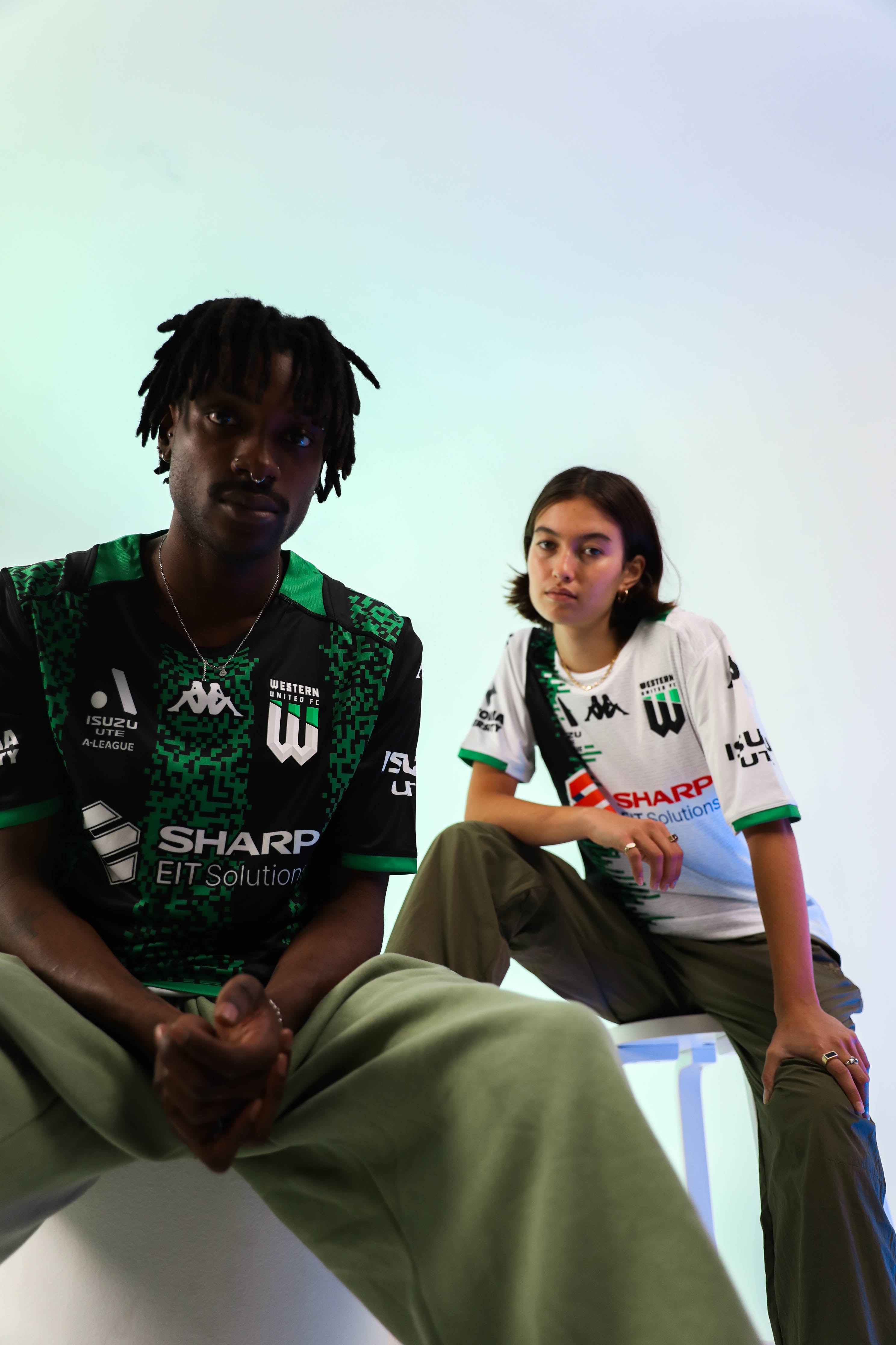
10. Western United
Kappa are clearly running short on ways to remix the green and black stripes Western United has become so well known for, and this year's pixel-art home shirt probably isn't their strongest effort. If Minecraft did football kits. The away kit, which kind of gives the vibe of an old-timey TV that needs a smack to get its picture back, is slightly cleaner but not that much better, but at least they're both unique. People will either love them, or they'll steer well clear.
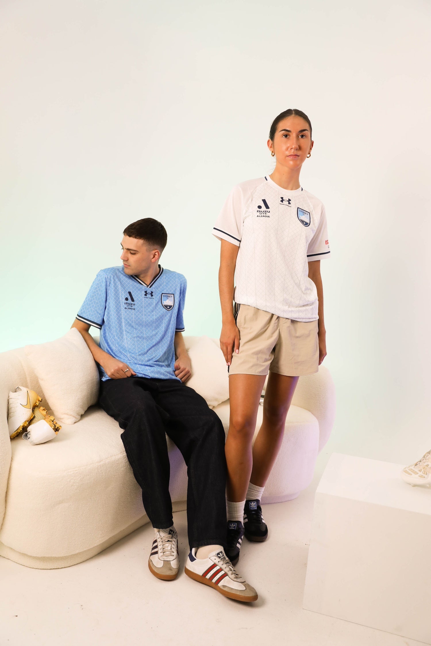
9. Sydney FC
Under Armour pushed the boat out with last year’s designs - so much so that they seem to have run out of creative juice this time around. Aside from a slight tweak to the Opera House tile-inspired pattern on the home strip, it’s hard to see a reason why you’d buy this shirt if you already have last year’s.
This isn’t to say they’re bad - they’re just not different enough to warrant a higher ranking. The change to white on the away strip is a welcome move, though.
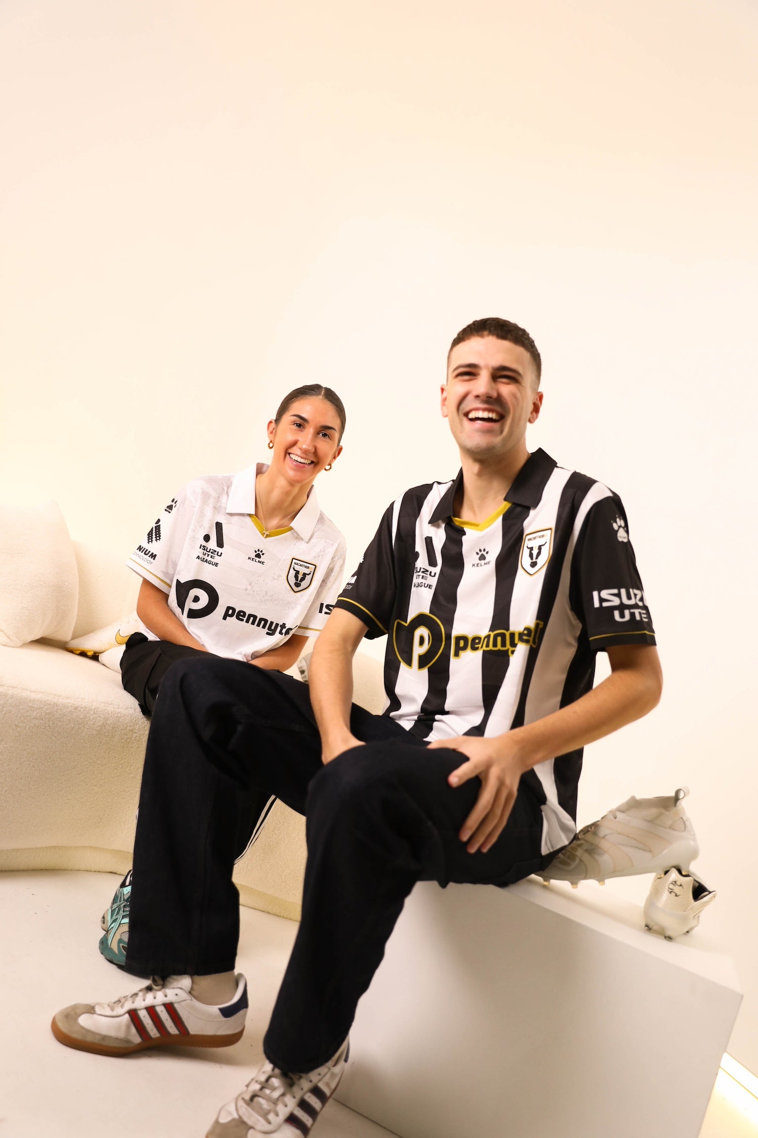
8. Macarthur FC
Macarthur’s Juventus era continues with a switch to Kelme this year (throwback!), and while it’s hard to mess black, white and gold up in general, these are probably the nicest kits we’ve seen from the club in its short history so far.
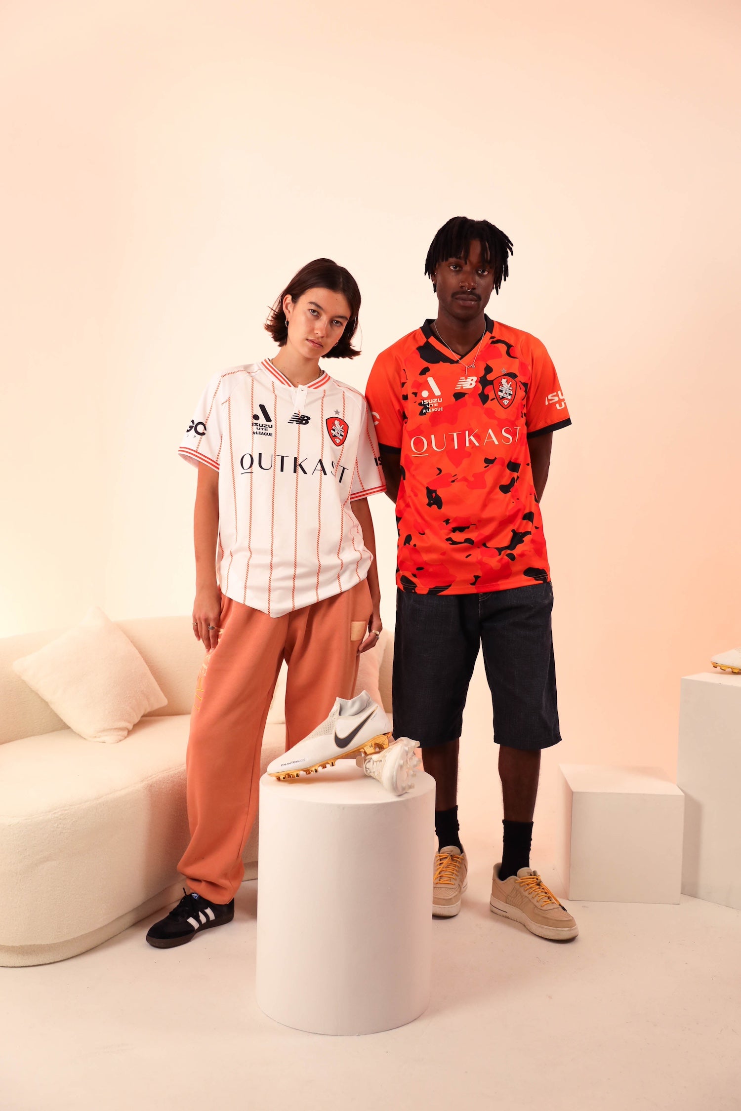
7. Brisbane Roar
Props to New Balance for being bold enough to push the boat out with a variety of crazy patterns, and thankfully in this case they pull it off - even if bright orange camo is a tricky thing to nail. Balancing the range out with a monochrome third shirt is a good decision as well, giving every fan an option.
6. Perth Glory
Perth have hit the button on their DeLorean and warped back to the ‘90s with both shirts, which their unique purple and orange colourway serves particularly well. We’re calling it now: the collared white away shirt will go down as a cult classic in years to come.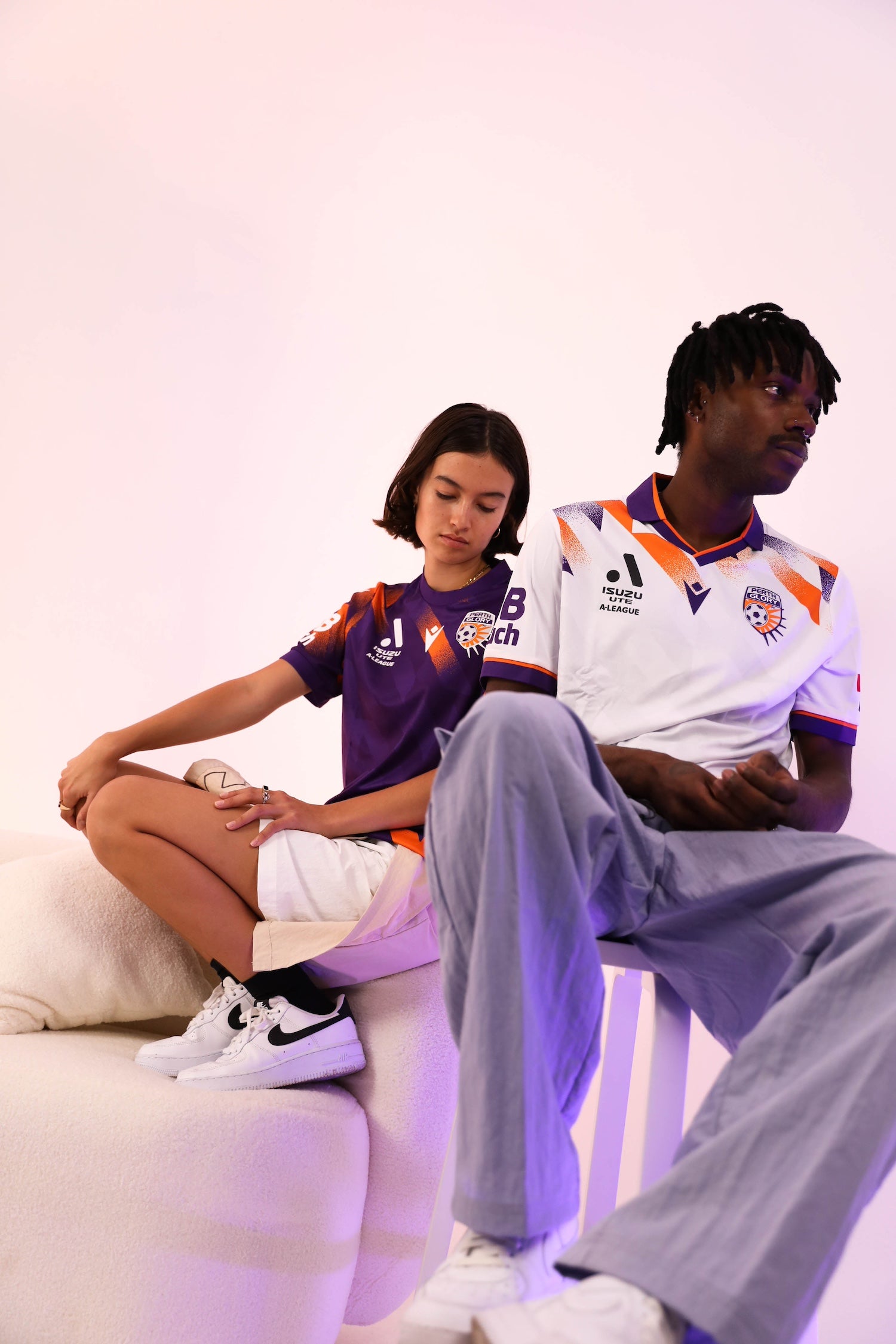
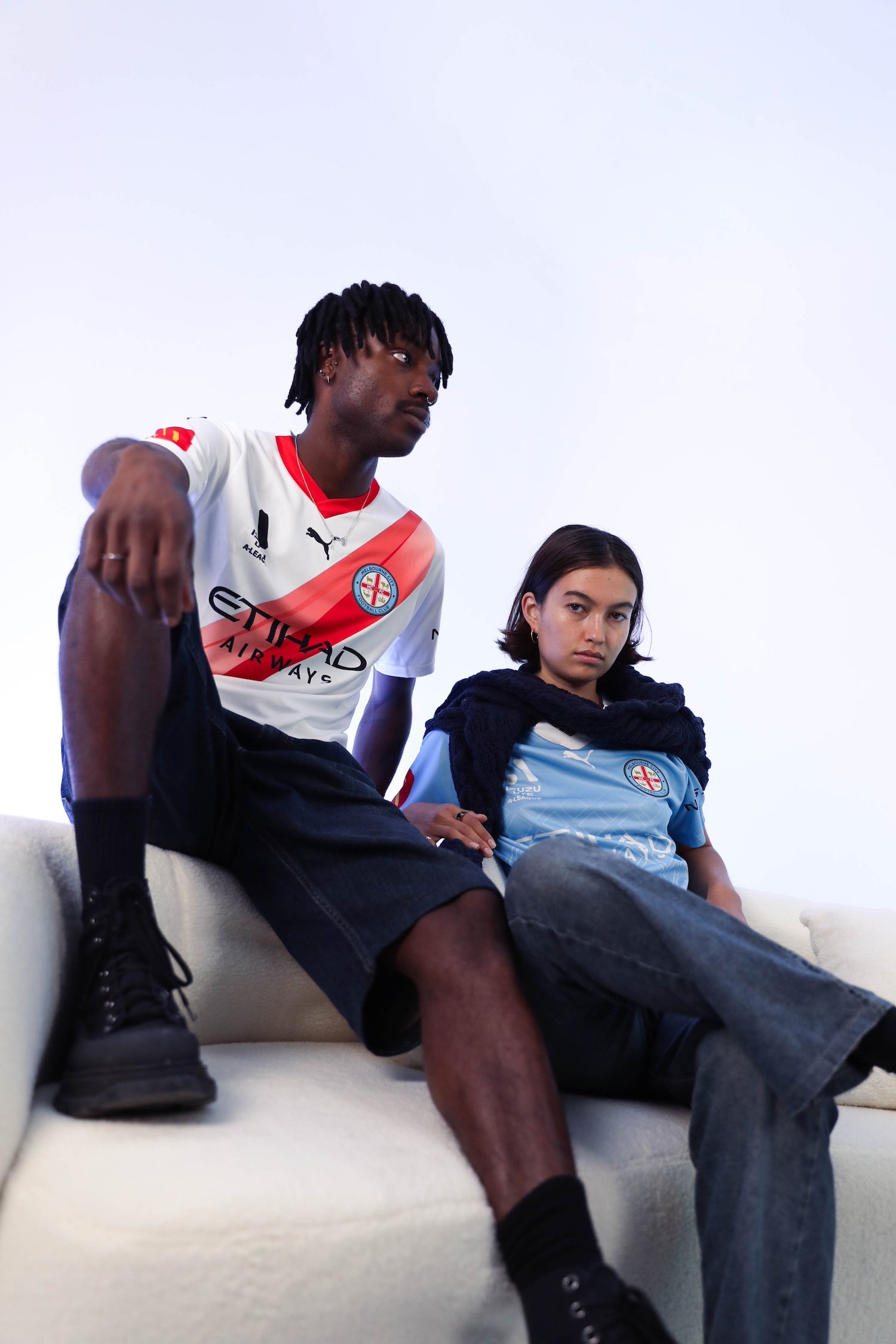
5. Melbourne City
Clean and classy, Puma certainly haven’t upset the apple cart with this season’s Melbourne City range, but it’s hard to find fault with them, either. We particularly like the remixed red sash on the third shirt - because they’ll always be the Heart to us, damnit.
4. Wellington Phoenix
Shoutout to Kiwi brand Paladin for continually pushing the status quo with the Phoenix’s hits, and this year’s Maori-influenced strips are among the best in the club’s history. The pattern that adorns both shirts comes from the tohu designed by local artist Charmaine Love gifted to the club by iwi Te Āti Awa.
3. Western Sydney Wanderers
The Wanderers’ first kits designed in partnership with the three stripes (and yours truly here at Ultra Football) bring the focus back on to the classic red and black stripes which have proven so enduringly popular throughout the club’s time in the league. The classy white and gold away shirt serves as the perfect compliment, making for two shirts that’ll go down as instant club classics.

2. Canberra United
The ALW’s Canberra United always deliver the heat with their unique blend of green shades, and this year’s shirt might be their best. All in all, it’s just a shame we won’t see it in the men’s competition as well. This year’s home shirt sees a return to the darker greens the club wore during its early years, separated by a white chevron and adorned with a unique indigenous artwork.
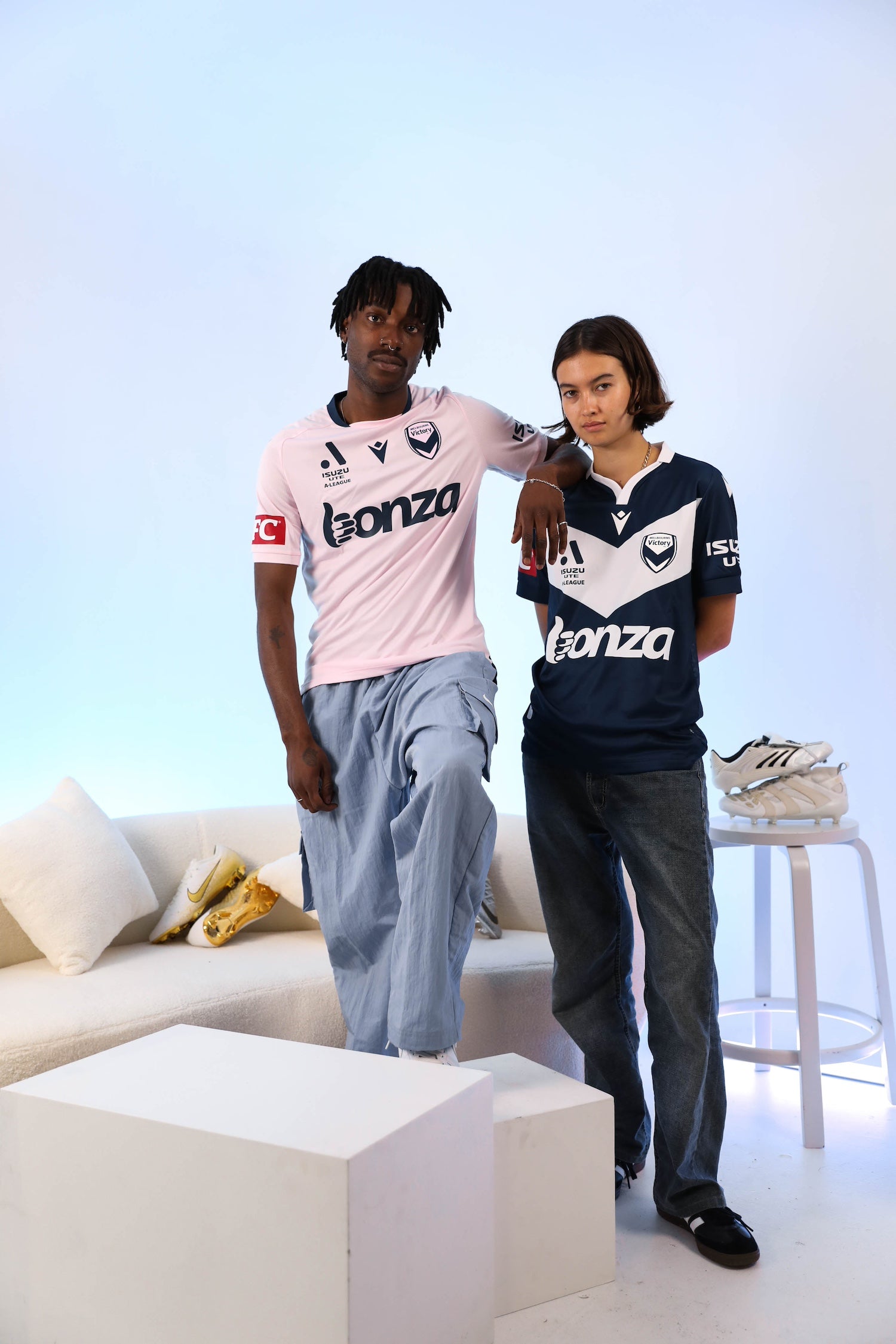
1. Melbourne Victory
You just knew as soon as that Sokkah Twitter-breaking light pink shirt dropped the Victory were gonna be number 1, didn’t you? The shirt, taking its unique hue from the common heath flower that serves as Victoria’s state flower, is a perfect choice to celebrate the city, while the home strip brings back the large white chevron in a bold throwback to the club’s halcyon years. As much as it pains this Sydney FC fan to say, the Big V gets an A+.
Share this:

